An Expense Tracker That Reads What You Type
Context
One form, a Google Sheet, and a week of spending to catch up on
The first version, from March 2026, was a form: pick a category, pick a date, type the amount, done. Every entry was also copied to a Google Sheet, because the app couldn’t do much on its own.
The form was fine for one expense. I rarely log just one. I catch up on a few days or a whole week in one sitting, and every entry meant the same six taps again.
For version 2 I wanted all my money in one place (spending, income, savings, money I’ve lent, subscriptions) so I stop keeping separate sheets. And logging an expense had to get quicker, not slower, or I’d stop doing it.
Everything in one place. Nothing required.
Building with Claude Code
Docs first, then design, then code
Laps took under 48 hours. This time I wanted to build it the way a real product gets built, and it was my first time doing that.
Before any code there was a product doc, a design system and a decision log: every choice, why I made it, and what I didn’t pick. It holds 40 decisions now, including the ones I changed my mind on.
Claude Code wrote the code. I made the calls, used every build on my phone, and sent screenshots of what was wrong. Every change ran on a separate test database with a copy of my data first, so my real entries stayed untouched until launch day.
Designing the Add
Four rounds to get one line right
Logging is the one thing I do every day, so most of the design time went here. There was no Figma. Every round was built in code, so I could try it on my own phone instead of looking at a picture of it.
- Round 1: three looks for the same old form. Same steps, new paint.
- Round 2: the form opened on its own, four taps instead of six. I turned it down: it was still my old form in a new order.
- Round 3: three ideas from scratch. Bubbles, where the category picker is also the month’s chart. Month, where the calendar is the home screen. And Say it, where you type one line.
- Round 4: Say it again, rebuilt around how I hold my phone.
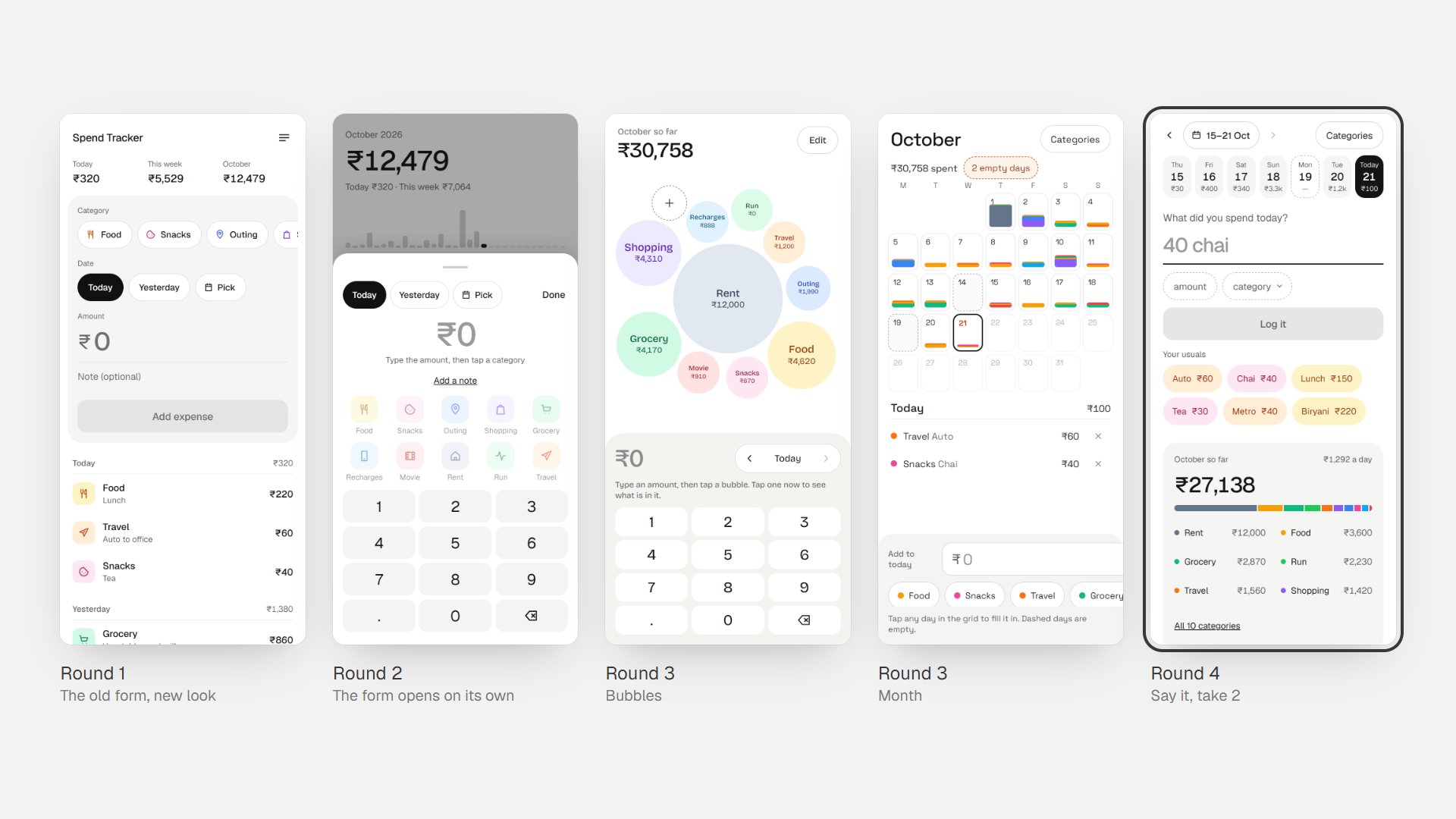
From the old form to one line, in four rounds.
Round 3 looked fine but didn’t work in the hand. A big amount made its bubble grow and move, so next time I had to hunt for it. Month’s calendar changed height from month to month, and its input sat at the bottom, right under the phone keyboard. Say it was the one I liked: it guessed the category for me.
Take 2 moved the line near the top, so everything I need while typing stays above the keyboard.
Say It
“40 chai yesterday” is ₹40, Snacks, yesterday
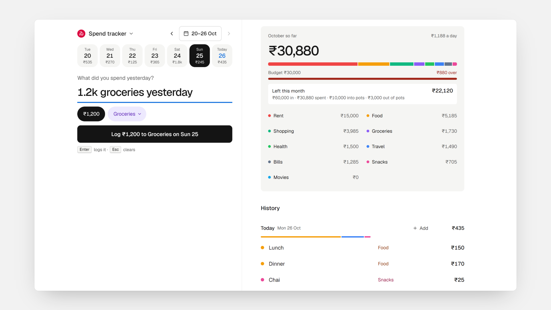
One line, typed the way I’d say it. It reads the amount (1.2k works too), the category from each category’s words, and the day: yesterday, sat or 17th. Whatever’s left becomes the note.
- A new word asks once: make it a category, or say where it goes. After that it always goes there.
- If I change a category by hand, it offers to remember that word.
- Your usuals: what I buy most, at the price I usually pay. Two taps, no keyboard.
- A word with no amount shows how often I’ve logged it and what I usually pay.
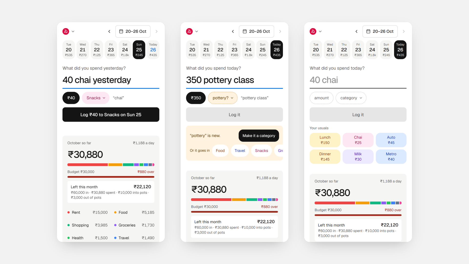
Type a line, teach a new word once, or tap a usual.
An empty app would have to learn every word from scratch. So my 10 categories started with 83 words taken from my old notes, like “chai” for Snacks and “auto” for Travel.
Catching Up
I log a week at once, so every day had to be one tap away
Round 4 picked the day from a strip that scrolled sideways. On my phone I didn’t know it scrolled, and it stopped at the 1st of the month. For someone who logs a week or two back in one sitting, that was the wrong control.
Now a date bar sits at the top with that week’s seven days under it, each showing what it cost. The arrows move a week at a time, and a month calendar covers anything older. The day stays where I set it until I’m done with the whole list.
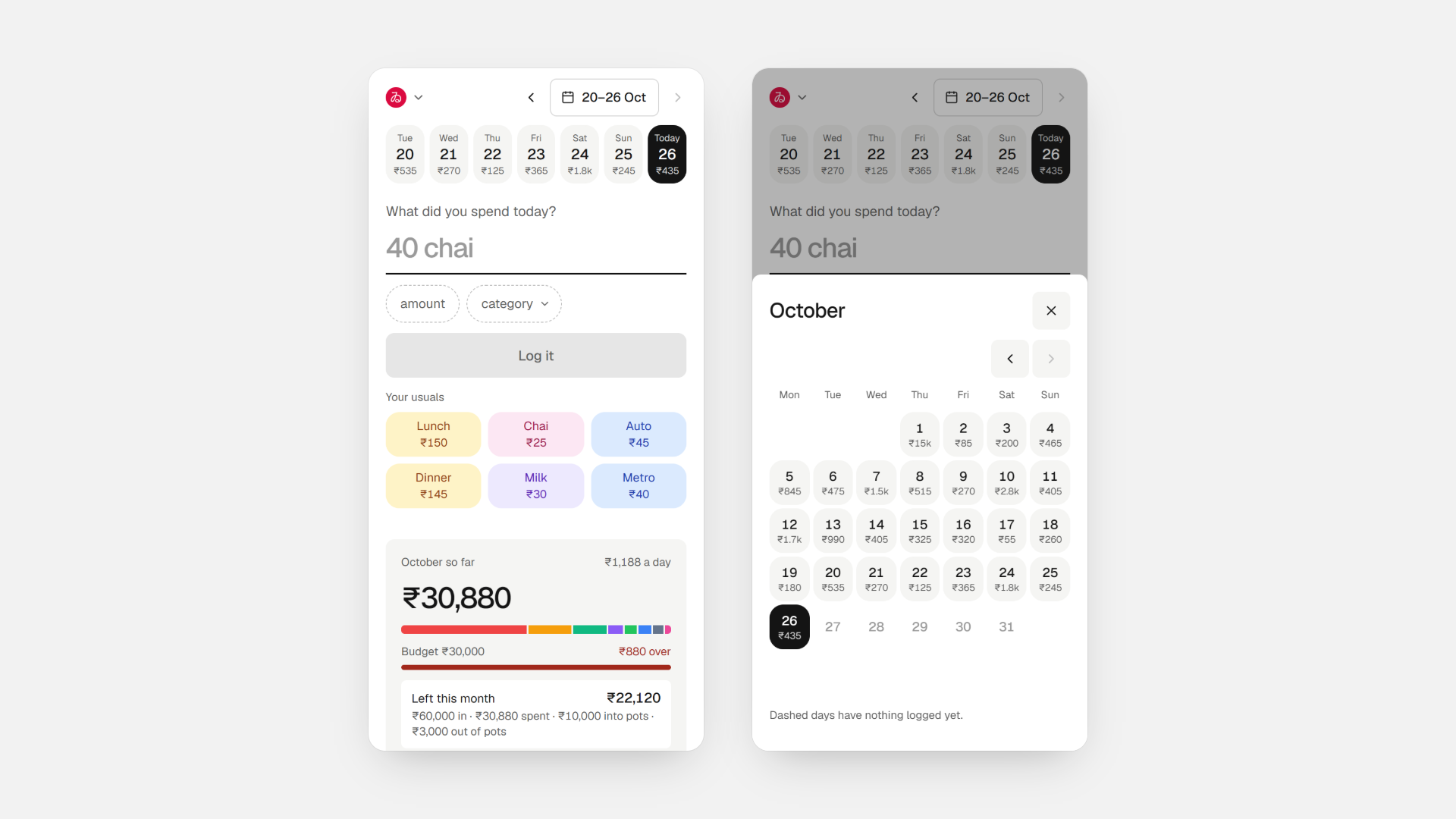
A week at a glance, and a calendar for anything older.
On the Laptop
Same app, side by side
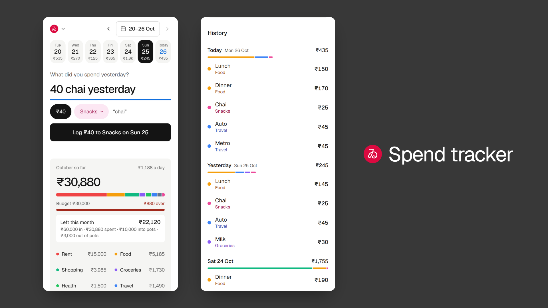
On a wider screen the line stays put on the left, with the month and History on the right. Enter logs, Esc clears, and ↑ brings back the last entry to fix it.
Launch
Moving 467 real entries without losing one
Version 2 changed how every entry is stored, so launch day had to be boring.
- A backup of every entry first, kept outside the project.
- Every database change ran on the test copy first, then the same checks: the number of entries, the total and the categories.
- On launch day the same script ran on the real database: 467 entries, 10 categories, and the total matched to the rupee.
- Sign-ups are off. It’s my app, and the login is just a password.
For Visitors
A demo with made-up data, not mine
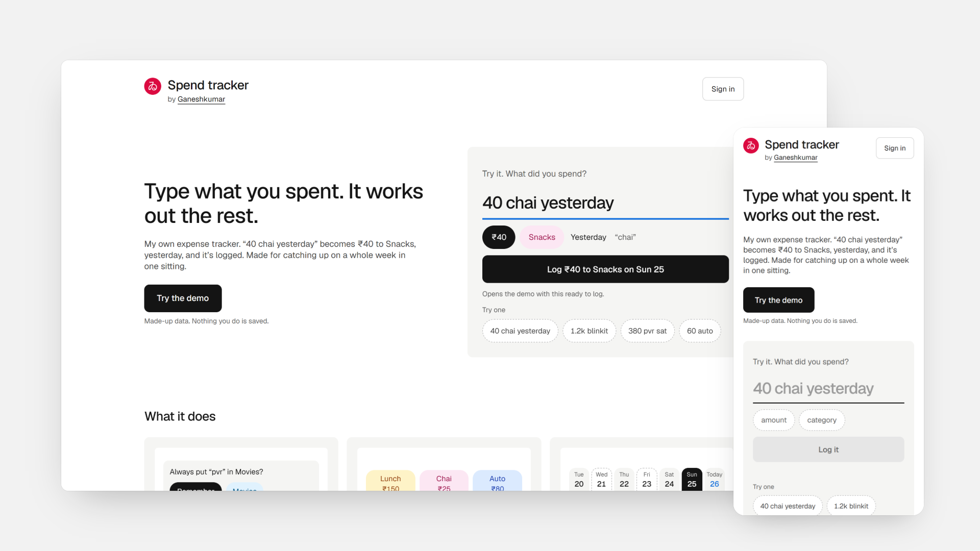
Signed out, the app opens on a landing page with a line you can type into. Log from it, or tap Try the demo, and you get the real app with made-up data. A bar on top says nothing is saved. My own phone and laptop stay signed in and open straight on Home.
Next case study
Taabi Procure
Auctions worth crores were running on someone else’s platform